ShopDreamUp AI ArtDreamUp

Deviation Actions


Suggested Deviants


Suggested Collections


You Might Like…


Featured in Groups


aboutalwaysartworksbeautifulbecausebetweencommentscosplaydantedevildmcdmc3energyfeelfromgethardheartherehopehypedimingameinterpretationlifemanymaymuchoutreadreferencesrockingseesincesomethingstoovergilwantedwelllwillyeahyesterdayyouyourfomentohugsssitbestalltheregotlikecrydsowaythankrightdifferentsaywithtry4getting
Description
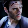
''You got that right...''
~ Vergil - Devil May Cry 4
Getting hyped?
I'm way too hyped about all my life and things are rocking out hard in here!
► THANK YOU so much for all the beautiful comments I read yesterday about Vergil.
I wanted to say that this is my interpretation, since there are so many different references between in-game and artworks, and I always try to do my best by heart with it. I hope you will like it and you will get some energy because THIS is the way I ''feel and see'' Vergil! (Smile)")
All the best!
HugSSS from your Dante... welll... yeah... your VERGIL!")
~ Vergil - Devil May Cry 4
Getting hyped?
I'm way too hyped about all my life and things are rocking out hard in here!
► THANK YOU so much for all the beautiful comments I read yesterday about Vergil.
I wanted to say that this is my interpretation, since there are so many different references between in-game and artworks, and I always try to do my best by heart with it. I hope you will like it and you will get some energy because THIS is the way I ''feel and see'' Vergil!
All the best!
HugSSS from your Dante... welll... yeah... your VERGIL!
Image size
3264x2448px 5 MB
Make
Apple
Model
iPhone 5
Shutter Speed
1/40 second
Aperture
F/2.4
Focal Length
4 mm
ISO Speed
50
Date Taken
Mar 7, 2016 6:02:02 PM +01:00
© 2016 - 2024 LeonChiroCosplayArt
Comments8
Join the community to add your comment. Already a deviant? Log In
I love the cosplay but the photo is lacking in both composition and post work effect.
On the cosplay I really like the hair and brows they are amazing. I like the interpretation, you look very determined. The angle of the shot don't show a lot of the cloth and accessory but what I see look very good too.
The composition, there is a lot of empty space in the right of the photo that tell nothing and must be removed. The post-work isn't good either, making circles and with both desaturated cool tone and oversaturated warm tones the overall effect is a bit dull. The burned circle of flat white in the middle don't look good and don't make sense since the sun is already burning the horizon.
You need to remove the Photoshop effect and 1/5 of the right and a little part of the top of the photo imo.
If there was a way of rating the photo and the cosplay separately I will give a good rate for the cosplay/interpretation and a bad rate for the photo and post work. As there is only one, I'll rate the overall effect.
Have I already said that the cosplay is amazing? Ho well, it was worth repeating I guess.
Vision: The interpretation is good
Originality: well its a classic, a good one but I can't really rate it high in originality.
Technique: good for the cosplay bad for the composition and postwork of the photo.
Impact: let me a mitigated impression but still striking enough to make me want to give a critic.